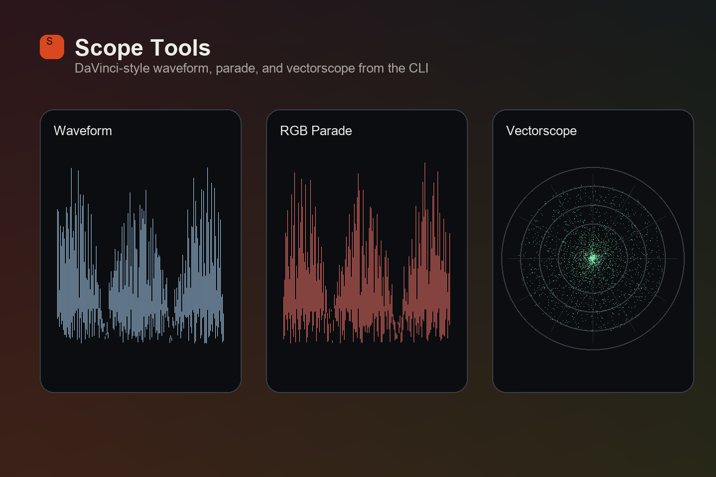
Scopes as a Small Image Analysis Tool
A small image-analysis workflow for generating waveform, RGB parade and vectorscope visuals from stills, built for teaching, writing, and explaining colour decisions.
Why this exists
Scopes are the best way to teach what an image is actually doing. A student can argue with you about whether a shot looks warm. They cannot argue with a vectorscope trace sitting off the red axis.
The problem is that scopes live inside grading software. That’s fine in a suite and useless everywhere else, when you’re building course material, writing a post, comparing two stills side by side, or trying to show someone why their skin tones drift, and opening Resolve to screenshot a panel is more friction than the explanation is worth.
So scopetools is a small analysis workflow: point it at an image, get scope renders out as files that can be dropped into a slide, a blog post, or a teaching deck.
The important choice is that there is no GUI. The output is the interface. For teaching, that is exactly the point: generate the evidence, place it next to the image, and keep the explanation moving.
AI helped with implementation, but the design problem was mine: decide what evidence a colour student actually needs to see, make that evidence portable, and make the output visually close enough to familiar grading scopes that it teaches rather than distracts.
The axis convention nearly everyone gets wrong
This is the detail that took longest to get right.
A vectorscope plots chroma on two axes. The intuitive assumption, the one you’ll find repeated across forums and more than one tutorial, is X = Cr, Y = Cb. It’s wrong, at least if you want to match what Resolve draws.
The way to settle it is not to reason about it. It’s to feed EBU colour bars through both conventions and see which one puts the targets where Resolve puts them. Blue and cyan belong on the right; red and magenta belong in the upper half. Only X = Cb, Y = Cr does that.
Once the axes are settled, the target positions can be anchored to observed Resolve behaviour rather than a formula that might carry the same mistaken assumption. That matters because students use these diagrams as evidence. If the evidence is rotated, swapped, or subtly wrong, the teaching becomes worse than no scope at all.
The architecture follows the explanation
The core of a vectorscope is less exotic than it looks. Every pixel becomes a point in Cb/Cr space, and what you need to show is the density of those points. The tool is organised around making that idea visible rather than around becoming a full application.
The practical UX decision is speed versus fidelity. A 4K frame contains millions of pixels, but a teaching diagram does not need every single one plotted to explain the shape of the signal. Sampling can produce a visually equivalent trace much faster, as long as the quality setting behaves consistently across source resolutions.
That is the kind of architectural choice AI can implement, but only after the teaching requirement is clear: make the evidence accurate enough to trust, fast enough to use while preparing material, and legible enough that the image and the scope can sit together in a slide without the tool becoming the subject.
Making it look like a scope
A raw density histogram looks like a scatter plot, not a scope. Real scopes glow. The bright core of a trace bleeds into a halo, and that halo is most of what makes the shape readable at a glance.
This was a UI problem as much as an image-processing problem. Plot the data too literally and you get one bright blob with no readable falloff. Blur it too much and the trace becomes decorative fog. The useful version has a readable core, a soft halo, and enough dynamic compression that sparse information remains visible next to dense areas.
That visual treatment is not pretending to be a Resolve panel. It is borrowing the conventions students already recognise so the generated output can function as a teaching object.
Where it fits
I use this for course material, for explaining a grade in writing, and for quick analysis when I want to look at an image properly without opening a project. It sits in the same family as the colour teaching work, not just making images look better, but giving people a way to see what an image is doing.
There’s no GUI. The output is the interface, and that suits how it gets used: run it over a frame, drop the result into a slide or a post, move on.