A Private Living Costs Tracker
A private tracker for the real shape of living costs: recurring commitments, one-off expenses, places, categories, projections, and the small interface decisions that make money easier to read.
The problem
Most expense tools split life into categories that look neat in a database and slightly less useful on a Tuesday afternoon. Subscriptions live in one mental bucket, rent and utilities in another, groceries in another, and the odd expensive repair or medical appointment somewhere else entirely. The problem is that money does not care about those boundaries. It leaves the account as one continuous pressure.
This tool started as a way to understand recurring costs, but that was only one part of the picture. The more useful question became broader: what does life actually cost across the month, and which parts of that cost are predictable, variable, occasional, or easy to forget?
So the app became a private living costs tracker. Recurring commitments are still important, but they are no longer the whole model. Rent, subscriptions, software, utilities, health costs, groceries, equipment, one-off purchases, and local places all need to sit in the same interface without becoming a bank clone or a budgeting sermon.
It uses the same local-first pattern as the travel tracker because the product expectation is similar: entering something should feel immediate, private, and reliable. Sync can be useful, but it should never be the thing the interface depends on.
The implementation was AI-assisted, but the harder work was not asking for “an expenses app.” It was defining the shape of the problem: recurring and non-recurring costs in the same mental model, quick entry without shame or friction, privacy as a default, and an interface that explains spending without turning it into a moral lecture.
Recurring is a layer, not the product
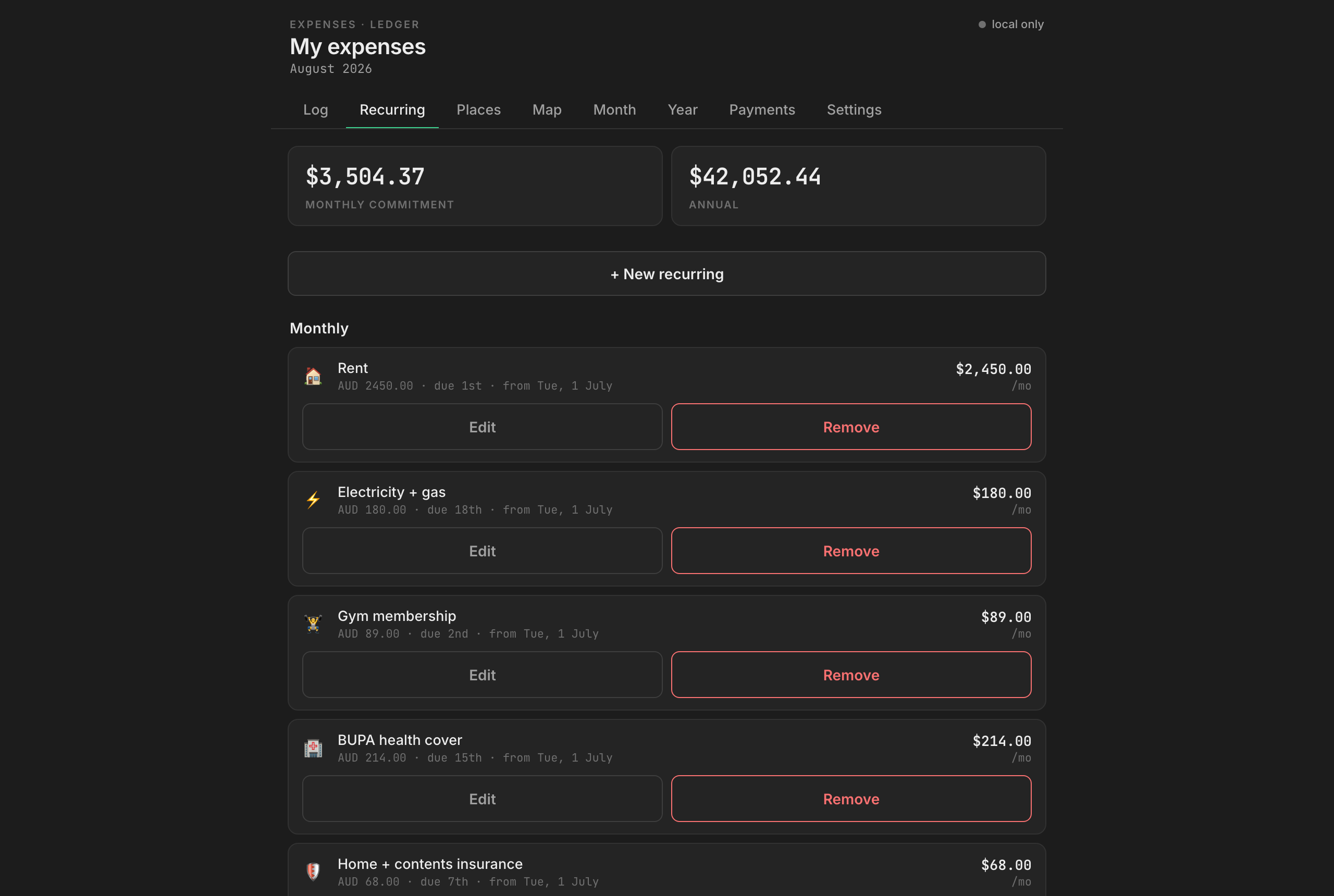
Recurring expenses still have their own logic because they behave differently from ordinary transactions. They are templates rather than events. A template can project forward, estimate annual cost, pause for a month, end on a specific date, or generate a backfilled history if I am adding something I have been paying for a while.
That matters, but it is only one layer. A useful cost tracker also needs the ordinary stuff: the once-off purchase, the hardware upgrade, the pharmacy visit, the dinner, the domain renewal, the replacement cable, the boring expense that will never happen on a schedule but still belongs in the month.
The model therefore treats expenses as first-class records and recurring rules as one way those records can be created. That distinction keeps the interface honest. It lets predictable costs contribute to monthly projections without forcing every cost into a subscription-shaped box.
The practical result is a dashboard that can answer several different questions without making me jump between tools: what is already committed before the month starts, which categories are carrying the most weight, what was a one-off spike rather than a new pattern, which places or vendors keep appearing, and what the year looks like if the current commitments continue.
The interface work
Most of the work here was not glamorous backend machinery. It was deciding how the app should make private information readable without turning it into a spreadsheet wearing nicer clothes.
The UI follows the same design system I have been using across the personal tools: compact metric cards, restrained colour accents, rounded panels, status chips, quiet dividers, clear empty states, and action buttons that behave consistently from one app to the next. The portfolio tracker, travel tracker, expenses app, teleprompter, and kiosk tools are different products, but they share an interface language so I do not have to relearn my own software every time I open something.
In this app, that design system shows up in a few concrete ways.
The top-level cards separate fixed commitments from month-to-date movement, so recurring and non-recurring costs are visible without collapsing into one noisy total. Category chips make scanning faster than a long filter menu. Expense rows prioritise the fields I actually need to recognise a cost quickly: name, category, amount, place, date, and whether it came from a recurring rule. Destructive actions follow the same pattern as the other apps: obvious, separated, and never styled like a casual navigation choice.
Places are part of the interface too. Expenses can attach to locations populated through OpenStreetMap search, then appear on a Leaflet map. The map defaults to a stable Melbourne view rather than trying to be too clever. Auto-fitting every pin sounds helpful until one old overseas entry drags the whole map halfway around the planet. A fixed home context with a reset button is less flashy and much more useful.
Design system, not isolated screens
The important design decision was treating this as part of a small family of tools rather than a one-off dashboard. I have enough personal software now that inconsistency becomes a cost of its own. If each tool invents its own buttons, cards, tables, warnings, and spacing, the friction moves from the problem into the interface.
So the expense tracker inherits the same product grammar as the rest of the apps: metric cards for at-a-glance state, soft panels for grouped information, small caps and chips for metadata, tables only where tabular comparison is genuinely useful, local-first assumptions for private data, import and export controls that make data ownership explicit, and mobile layouts that prioritise entry speed over decorative density.
That last point matters. A living costs tracker is only useful if it is easier to add an expense than to postpone adding it. The interface has to make the common path quick, then let the more detailed structure exist underneath when needed.
Architecture shaped by privacy
The app is built around local-first storage with optional sync. The first write happens locally, so the interface stays fast and usable even when the network is not available. Sync then moves changes across devices when it can.
That architecture is not just a technical preference. It matches the nature of the data. Personal finance information should not feel like public website content that happens to be hidden behind a login. The app keeps the working copy close, makes export straightforward, and treats cloud sync as a convenience rather than the centre of the product.
The same principle guided the Supabase setup. The anon key is public by design because Vite inlines VITE_* variables into the client bundle. Privacy comes from row-level security and account boundaries, not from pretending a frontend key is secret. For a single-user app, public signup should be closed after the account exists; otherwise the database is private per user but still open to anyone creating their own account on the project.
The useful bugs were product bugs
The sync layer did reveal the usual seam problems: numeric values returning as strings, camelCase local state meeting snake_case database columns, and pagination limits that can silently hide data if you assume a pull is complete. Those are useful engineering lessons, but the more interesting bugs were product bugs.
For example, deleting a recurring item is not one action. It could mean removing a single projected payment, ending the rule from this month forward, or deleting the template and leaving historical expenses intact. Those choices are different in real life, so the UI has to ask the question in real-life language rather than expose the database model.
The same is true of annual costs. A yearly payment is not “small” just because it appears once. A monthly projection is not “real” just because it is generated. A one-off cost is not noise if it explains why a month behaved differently. The interface has to hold those distinctions clearly, otherwise the app produces clean numbers and muddy understanding.
What it is for
The goal is not obsessive tracking. I do not want a tool that turns every coffee into a moral event.
The goal is awareness. I want to see the cost of the life I am actually running: the fixed commitments, the flexible spending, the one-off hits, the places where money repeatedly goes, and the shape of the year if nothing changes. That is a different product from a recurring subscription tracker, even if recurring expenses were the first doorway into it.
The more I build these small tools, the more the same pattern keeps appearing. The useful work is not only in implementation. It is in deciding what the tool should understand about the messy human system around it, then designing an interface that keeps that system readable.