Everything in its right place
Turning a spreadsheet of gear into a useful map of where it lives. A case study in designing around real furniture, revising assumptions, and keeping a private tool inexpensive to run.
For years my gear lived in a Google Sheet with nine tabs. Cameras, computers, audio equipment, tools. It worked well enough that I kept adding to it.
It could tell me whether I owned a particular lens. Finding that lens was another matter. A location recorded as “Home” was not much help when I was already standing at home, looking for it.
That was the brief: make the inventory useful at the moment I needed to find something.
I used AI coding agents to implement the application. My work centred on defining the problem, choosing the architecture, and reviewing successive versions against how I actually store and use equipment. The most useful changes came from trying an interaction and noticing where its assumptions fell apart.
Start with the way things are used
The old spreadsheet contained more than a list of objects. It contained years of decisions about how to group them, including some that had stopped making sense.
“Controller” could mean a gamepad or a DaVinci Resolve control surface. Technically defensible, but unhelpful when looking for editing equipment. Bags and cases had accumulated under “Tools”. The location field sometimes held the name of whoever had borrowed an item.
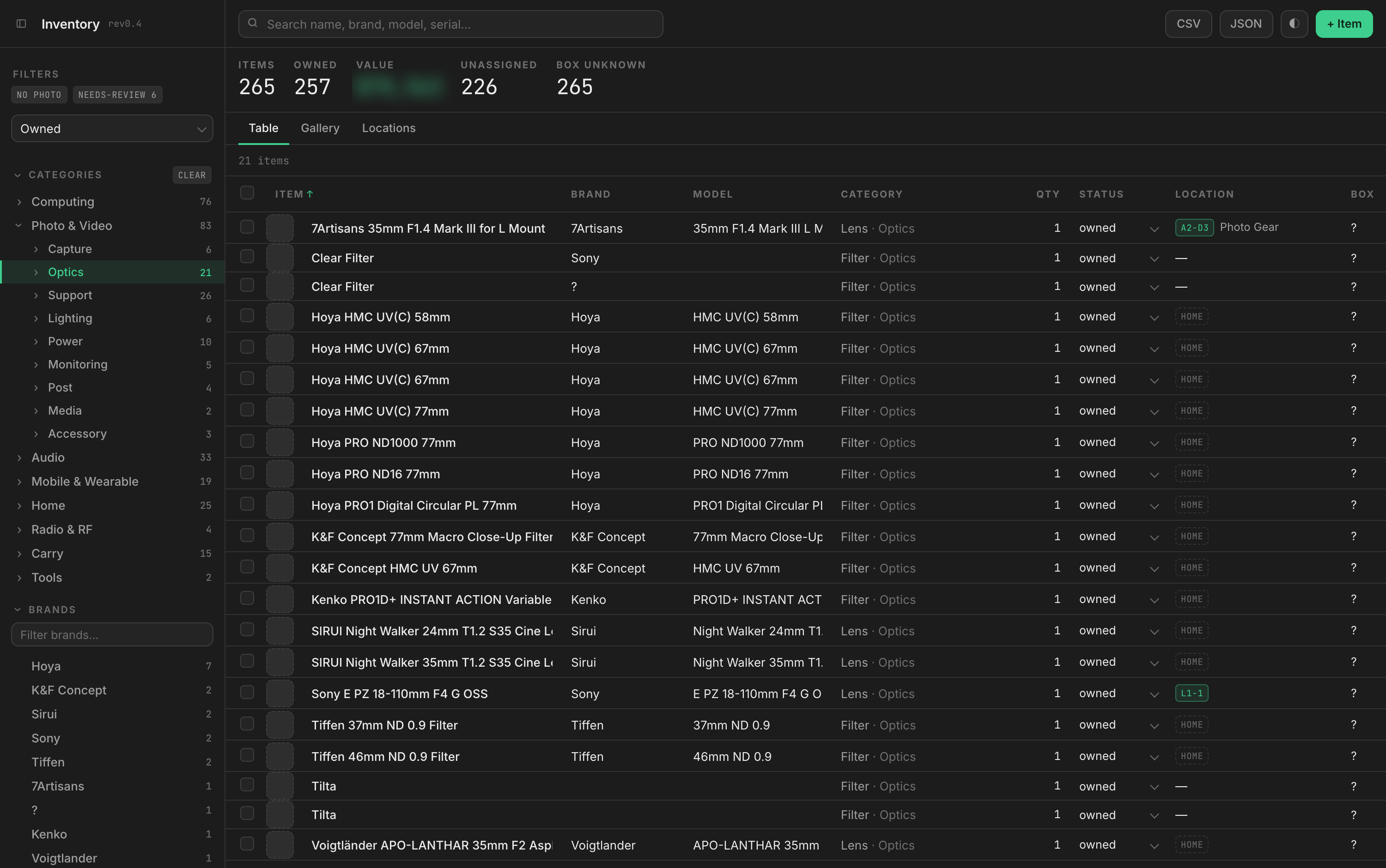
Moving those columns into an app would have preserved the confusion. I reorganised the catalogue around the context in which I use things, then their function and type: Photo & Video → Optics → Lens, for example. Borrowing became separate from storage, so who has an item no longer replaces where it belongs.
The aim was to make browsing follow a familiar thought process. If I am preparing a shoot, I should be able to start with photography equipment and narrow the list from there.
Give the furniture a place in the interface
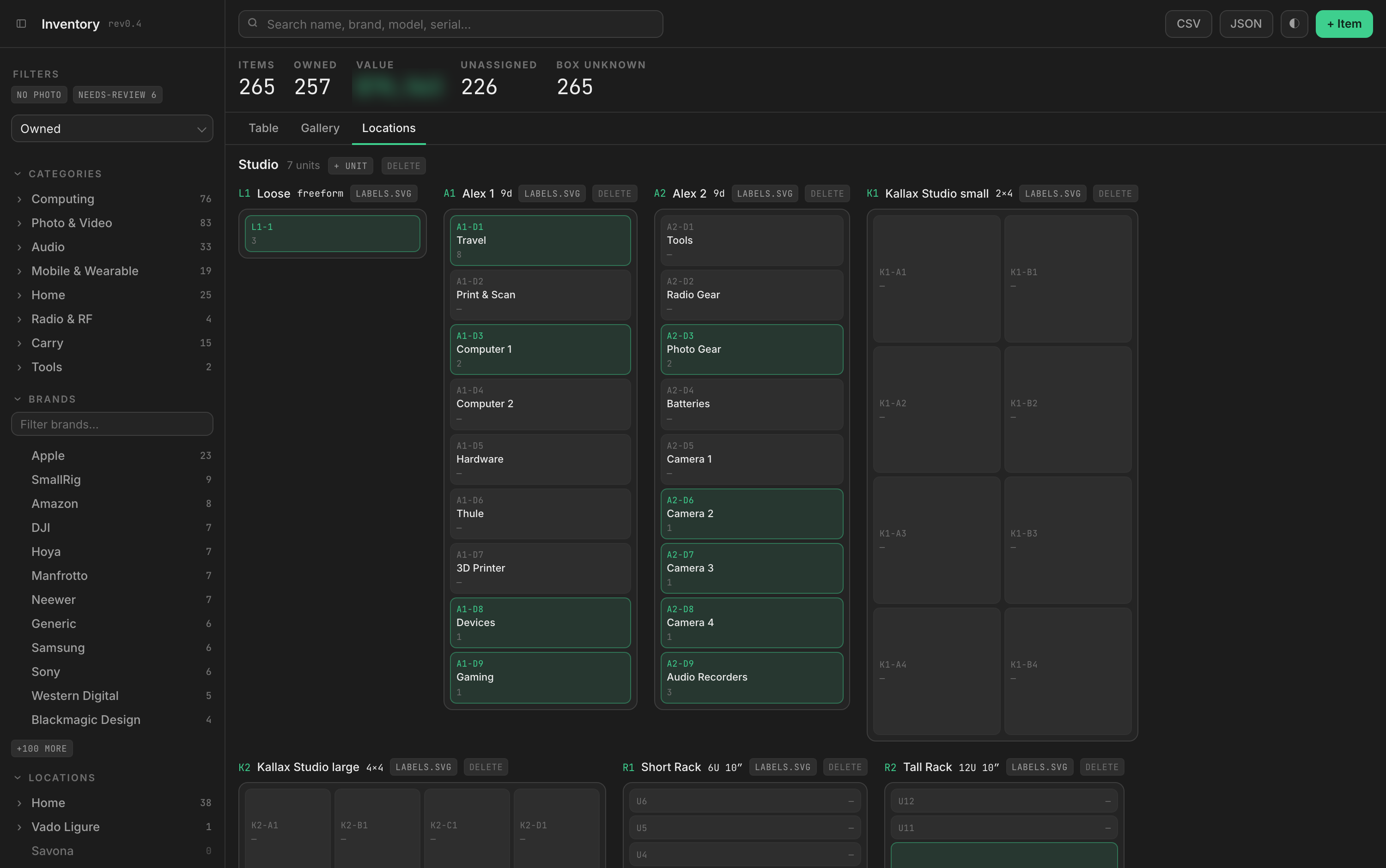
An item’s address follows a simple hierarchy: place, room, storage unit, compartment.
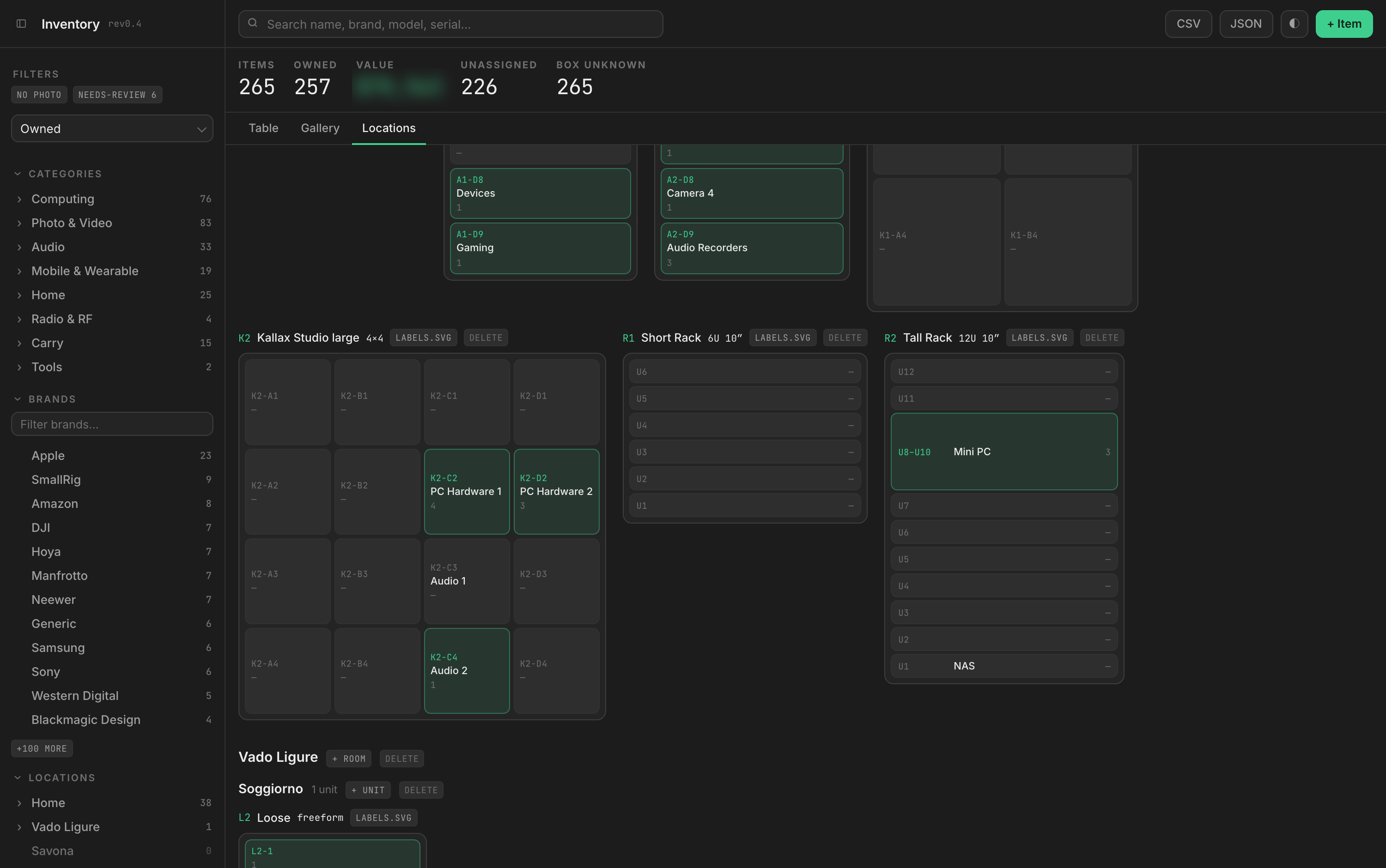
The important decision was to make that last part visual. A Kallax shelving unit appears as a grid. An Alex drawer unit appears as a vertical stack. A rack follows the numbering on its rails, starting at the bottom. These are shapes I already recognise from the room.
That changed what the application needed to ask. “Eight compartments” sounds sufficient until you try to draw it: two columns by four rows and four columns by two rows describe different furniture. Asking for the shape makes the diagram useful when I am standing in front of the unit.
The model also needed to accommodate less tidy arrangements. An air purifier stands on the floor; equipment sits on a desk or on top of a shelf. Each room therefore has a “Loose” location. Recording those objects should not require inventing a drawer for them.
Racks exposed another assumption. An early version treated overlapping positions as a mistake. In practice, several small devices can share the same shelf and vertical space. I revised the model to allow that arrangement while retaining the physical limit of the rack’s height.
Working through these cases made the diagrams more faithful to the room. It also made clear where validation helps and where it simply gets in the way.
Make putting things away easier
Finding an item depends on having recorded its location. If that step is tedious, the database gradually stops reflecting the room.
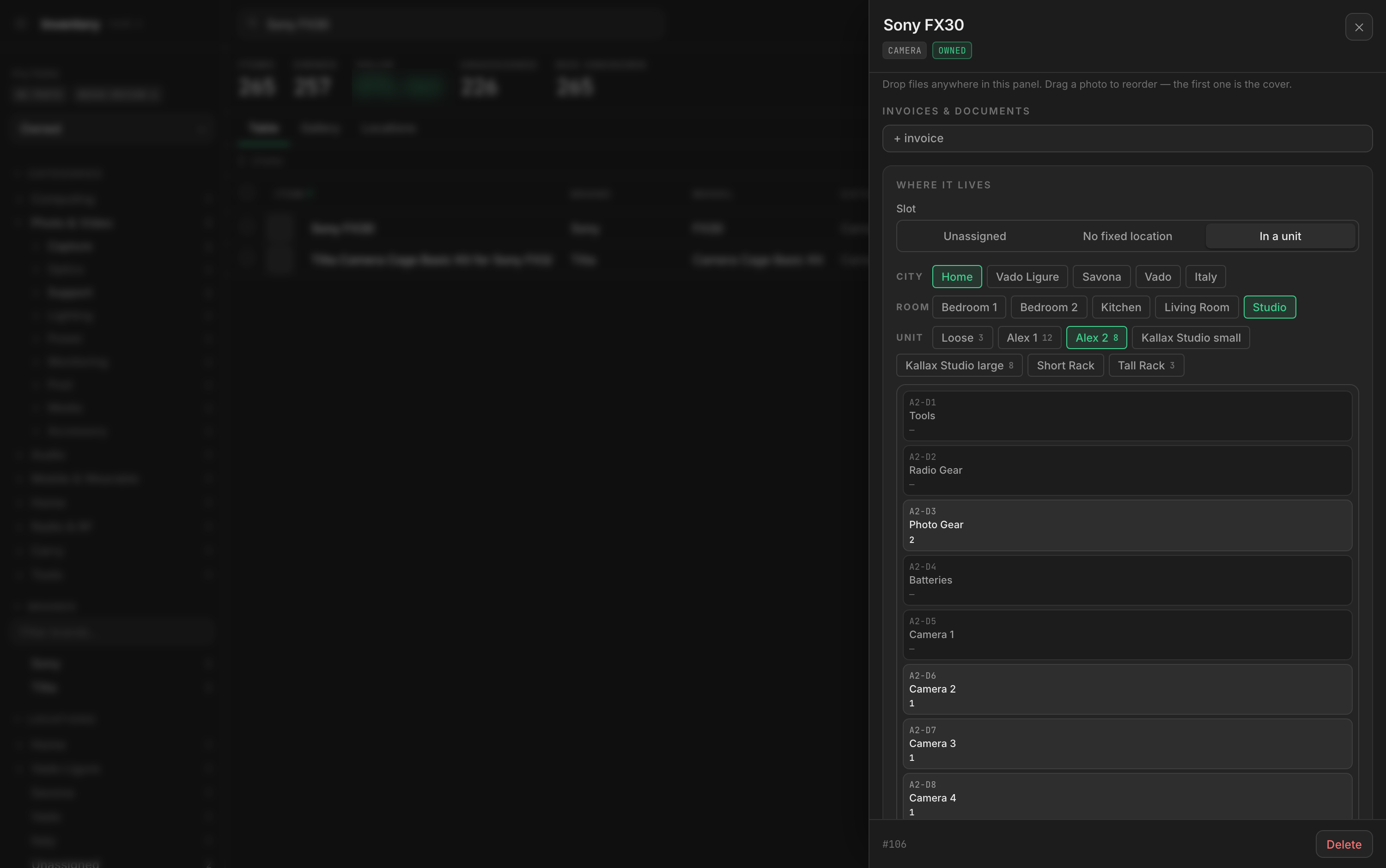
The first placement control was a long dropdown of storage units. It was workable with a few entries, but became harder to scan as rooms and furniture were added. I replaced it with a sequence: choose the place, choose the room, choose the unit, then select a compartment from its diagram. Choices that have only one possible answer disappear.
Trying the picker revealed a second problem. In the storage overview, green meant a compartment held something. Reusing that treatment in the picker made occupied drawers look selected, even when the item had not been assigned to them. I changed occupancy to neutral shading there and reserved green for the selection. The same information needed a different visual emphasis because the task had changed.
There was a similar ambiguity in “no location”. It could mean I had not recorded one yet, or that the item deliberately had no fixed home. Those now appear as separate choices. That keeps Unassigned useful as a list of work still to do.
Keep the labels useful when things change
A storage system needs to survive reorganisation. A drawer labelled “Camera accessories” might hold something else next month.
I separated its permanent address from its editable name. A code such as A2-D3 stays the same when the description changes. Printed labels can therefore remain attached to the furniture while the inventory evolves.
The app exports labels with a readable name, the permanent code and a QR code. They are generated locally as vector files, keeping label creation independent of an external QR service and making the output suitable for different print sizes.
Scanning a label with a phone opens the private inventory, asks me to sign in if needed, and takes me straight to the list of gear assigned to that compartment. I can see what belongs in a drawer without opening it or searching the whole catalogue.
The QR code contains a link to the compartment’s permanent address. Its contents stay in the database, so moving gear updates the list behind the label without needing to print a new QR code.

This is where the digital catalogue meets the physical routine: look up an item to find its drawer, or scan a drawer to see what belongs inside.
Choose an architecture for the actual workload
This is a private tool for a few hundred objects. I wanted access from different devices without another server to maintain or a recurring subscription for a small personal database.
I chose Cloudflare Workers to serve the interface and handle requests, D1 for the structured records, and R2 for photographs and invoices. Cloudflare Access provides the sign-in boundary. Keeping those responsibilities together gives the application one hostname and a small set of services to manage.
The intended workload fits within their published free allowances. That is a sizing decision for a small private application, rather than a guarantee about future costs. The relevant limits are documented for Workers, D1, R2 and Access.
Photographs offered a more useful optimisation than squeezing the item records. Full-resolution camera files are unnecessary for recognising a lens in a drawer. The browser crops and resizes each photograph before upload, producing a catalogue image and a smaller thumbnail. That reduces the data uploaded and stored, and avoids a separate server-side image-processing service.
The location diagrams also load a compartment’s item details when needed, rather than fetching every item’s details upfront. These choices keep the amount of data moved closer to what the current task requires. I have not measured a before-and-after bandwidth saving, but the design avoids transferring originals and loading details that are not being viewed.
CSV and JSON exports keep the records accessible outside the application. A personal tool should be inexpensive to leave as well as inexpensive to run.
A useful system still needs using
The catalogue now holds 265 item records. The screenshots capture a working application with the physical organisation still underway: many objects remain unassigned, and photography is unfinished.
That is the next test of the design. Recording a location needs to be easy enough to do while putting something away, and useful enough that I return to it when looking for the item later.
The decisions I would carry into another project are the ones that support that routine: model the actual environment, revise rules when use exposes a bad assumption, and spend storage and bandwidth on what the task needs.
For this one, success is straightforward. When I need the lens, I want to see A2-D3 — Photo Gear and open the right drawer first.