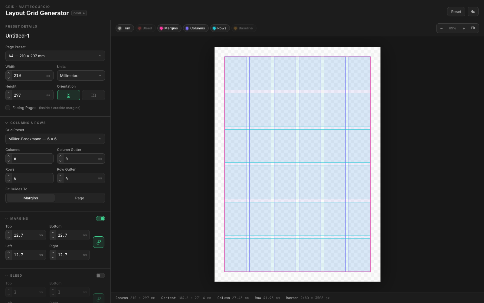
Grid: Rebuilding InDesign's Layout Dialog as a Browser Tool
A browser tool for designing print and screen layout grids, shaped around familiar design workflows, clean exports, and one consistent geometry model.
The problem
I kept rebuilding the same thing by hand. A layout grid, page size, margins, bleed, columns, rows, a baseline, is the first thing you set up in any print or screen document, and every tool makes you set it up again from scratch. InDesign has a good dialog for it. Figma has a different, worse one. Illustrator wants you to draw guides. And none of them will hand you the grid as a file you can drop into something else.
What I wanted was small: describe the grid once, see it, and export it as SVG for Illustrator, PNG for a mockup, or CSS for the web. No account, no install, no document to manage.
So grid.matteocurcio.com is a static page. No account, no install, no server-side project state. The point was not to make a big design platform. It was to make the grid setup moment portable.
AI helped with implementation, but the design authorship was in the product brief: match how designers think about page geometry, avoid hidden state, make export trustworthy, and keep the interface light enough that it feels like a dialog rather than another application to manage.
One renderer, three formats
The design decision the whole tool rests on is that there is one geometry model. The preview you see on screen and the exported files have to come from the same definition of the grid.
That sounds obvious and it is, but it is easy to get wrong. The tempting shape is a canvas preview for speed and a separate SVG writer for export, and then you spend the rest of the project chasing the ways they disagree: a half-pixel here, a rounded margin there, a baseline that starts one increment late in the file but not on screen.
The export rules follow from that. SVG is the master format because it carries the geometry cleanly. PNG keeps transparency, which is useful when the grid is going over artwork. JPG needs a white background because it has no alpha channel. Large raster exports are capped because browsers have real canvas limits, and a tool should explain that limit rather than quietly hand you a blank file.
That is the kind of implementation detail that belongs in the UX. If an export has to be clamped, the interface should say so. If a file format cannot represent transparency, the result should still look intentional.
Units, and not degrading the document
Everything converts through millimetres internally, but the important decision is what the tool deliberately does not do: it does not round the document every time you change units.
This is the kind of bug that only shows up when someone flips the unit dropdown a few times. A4 is 210 mm. At the CSS reference of 96 px per inch that’s 793.7 px, which displays as 794. Round at conversion time and switching back gives you 210.08 mm. Do it four more times and your A4 page isn’t A4 any more. Rounding belongs at the display layer, never in the model.
The input behaviour is also deliberately forgiving. You can type a value with a unit and override the dropdown in place. That matters because people do not always move through forms in the order the UI designer expected. Sometimes you know the page is 8.5" wide and you just type that.
Facing pages are not two pages
The spread mode was the part that needed real thought. A facing-page document isn’t two documents side by side, it’s one canvas with mirrored geometry. The inside margin sits at the spine on both pages, so left and right mirror each other. A binding allowance widens both inside margins to cover what the bind swallows. And bleed applies to the two outer edges only, because nothing bleeds at the spine.
Each page still carries its own columns, rows and baseline, so a 6-column spread is 6 columns per page, not 6 across the pair. That matches how InDesign counts and how anyone laying out a magazine thinks about it.
Measuring text properly
The printed-measurement band annotates every dimension along both axes. Fitting that text was where an approximation quietly failed.
The bug was a good reminder that visual tools need visual debugging. A label that fits in theory but overruns in the exported file is not a “minor implementation detail.” It breaks trust. The measurement labels had to be measured as rendered text, because monospace fonts are monospace right up until the browser swaps a missing glyph for a proportional fallback.
The lesson is less about the code than the standard: if the tool exports something for designers, the exported object has to be treated as the product, not a secondary output.
The deploy bug that cost two releases
The site is on Cloudflare Pages, connected to a GitHub repo, so deploying is git push. Assets originally carried max-age=3600. HTML is served uncached. That combination is quietly lethal: a redeploy ships new markup against an hour-old stylesheet and an hour-old script. It doesn’t fail cleanly, it renders as a half-updated page. Switches drawn as bare dashes. New defaults silently ignored. It looks like a bug in the release rather than a caching problem, which is why it got through twice.
The standard fix is a version query on the asset URLs, so I added ?v= and bumped it per release. That fixed the browser half. It did not fix the deploy, and the reason is worth stating plainly:
Cloudflare’s edge cache behaviour had to be tested, not assumed. The browser and CDN were not invalidating in the same way, so the tool could look fixed on one URL and stale on another. The debugging work was partly technical, but the product consequence was simple: returning users should not get a mismatched interface after a release.
So the assets are now max-age=0, must-revalidate. Bumping ?v= on release is still worth doing for browser caches, but it is not what makes a deploy safe.
The eventual fix combined conservative cache headers, explicit versioning, and visible revision labels in the interface. That last piece is not decoration. When you are debugging a static tool across a CDN, the UI needs to tell you which build you are actually looking at.
The clean answer would be content-hashed filenames, which needs a build step, the one thing this project intentionally avoids. For now the revision badge is the trade-off: small tool, no build system, visible release state.
What it does now
Page presets cover ISO A0-A7 and B2-B5, US sizes, other print formats down to business cards and record sleeves, and screen sizes from desktop to social. Grid presets are grouped by how they get used rather than by number: editorial 6 and 12 column, Swiss 4 x 8, Müller-Brockmann 6 x 6, magazine 6 x 9, newspaper 5, then landscape and web sets.
Margins, bleed and baseline switch on and off as whole features. A disabled section keeps its values but contributes nothing to the geometry, so turning bleed off gives you a canvas at exactly trim size rather than a canvas with zeroes in it.
Exported SVG carries real physical units and named layer groups, so it opens cleanly in Illustrator or Affinity with the structure intact rather than as a soup of paths. And there’s a Copy CSS Grid button that emits the same grid as web layout values, because half the time the grid was going to end up on the web anyway.
Settings persist in localStorage, so it reopens where you left it.
Use it
No account, no install, nothing stored anywhere but your own browser. It’s free and it’s at grid.matteocurcio.com.